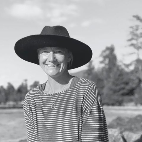
28 Jul Rebecca Santry
SAC Artist Interview Series: Multi-medium Artist Rebecca Santry
Written by Rachel Anne Farquharson
Blue, deep blue. Isn’t it the colour of peace and serenity? A colour that cools our peaked summer skin with its waters and enfolds us in its velvet winter skies when it is time to rest? Derived by the Egyptians some 5,000 years ago from the semi-precious stone Lapis Lazuli, deep-blue pigments remained a staple among creatives, meeting the brushes and panels of Renaissance artists before becoming prevalent in printing processes of the last two centuries. While some of these processes are automated, using cyan-blue as one of three colour additions to any commercial print (along with magenta and yellow), proto-photographic techniques such as that of the “Cyanotype” are executed manually and therefore immersive in nature. A grandchild of the architectural blueprint, cyanotype images offer ghost-like visualizations of their subjects arrested in time, disobeying the convention of the planar surface with tactility that delights.
A Slash of Blue—We are All Water
Rebecca Santry is the kind of artist enjoyed by art connoisseurs, good conversationalists, and, best of all, the curious. Originally from Buckinghamshire, UK, Santry’s intellectual and creative drives guided her away from discrete subject studies such as Maths towards a more humanistic taste for history, languages, and the visual arts. Armed with an appreciation for sculpture’s tactility and numerous sketchbooks, she hopped the Atlantic pond seven years ago in search of temperate climes and a communion with nature. And so, she found Squamish and the raw natural environments of British Columbia. Currently exhibiting as part of a group exhibition at Squamish’s Adventure Centre, I sat down with Santry (mask free!) to discuss the human condition of anxiety, how art can become a therapy for such stressors, and, of course, the colour blue.
Let’s start off with a little bit about your training back in the UK. Were you always drawn to print making or did the step-wise, physical process of the Cyanotype capture you more than anything?
Actually, neither! Funnily enough, the medium I enjoyed the most during my studies was sculpture. Three-dimensional, tactile work simply attracted me. I wasn’t prolific—whilst everyone else in my class was churning out artwork after artwork, I remained entirely committed to working one piece. To perfecting it before I could move on. As a teenager, I was somewhat extroverted and found the best outlet for my energies was art. We hadn’t a full spectrum of equipment at our disposal, but in addition to sculpture, I did attempt painting in a modest two-tone palette of black and white. The monochromatic vocabularies of Aubrey Beardsley and M.C. Escher were important inspirations at this time, as was their inventive use of line and graphic design. Life drawing was also very satisfying due to its contemplative process of observing the body’s form, explaining its geometries at an unhurried pace.
It seems clear that yours is a slow and methodical practice, arguably therapeutic as you prime your paper, select your subject, and reveal its form through exposure to sunlight. Can you walk us through your workflow, from start to finish?
Shall I or shall I not include my four year old son’s habit of walking across paper to which I have applied the first stage of cyanotype dye treatment? In all seriousness, I begin with a few sketches of the subject matter I hope to represent, either at home or after long visits in nature. Thereafter, I coat paper with a combination of ferric ammonium citrate and potassium ferricyanide, taking care to do so in a room with no or very little light. This chemistry effectively turns its substrate into UV light reactive paper. While I am in dire need of a proper dark room, I’ve managed thus far! Enclosed in a light-fast sonotube, I then transport the primed paper to my nature site for exposure and washing.
Recently, I took a mini-break to Ucluelet where I frequented a very small, quiet beach among the Artist Loops on the B.C.’s Wild Pacific Trail. I would walk around the rock halls there, assessing the flow of the water and my surroundings in a meditative fashion. Taking time to ground my bearings in the present, I next removed the treated paper from its protective packaging and exposed the chemistry to sunlight before introducing water to the process. The water works the submerged paper, pushing and pulling over its surface as blue populates and changes to form shapes and shadows. It is a mesmerizing and very physical experience. The final step is to leave the paper, exposed in the sunlight, to dry for about an hour. I like to spend this time in reflection. My ideas are often impacted by the unpredictability of environmental conditions—the strength of the sun or the current running in the water where I will eventually wash the artwork. While I feel as though I can see my hand in the making of my cyanotypes, the end result is often a surprise to even me. It is a sturdy reminder of nature’s power and volatile tendencies.
Wow! Sounds like alchemy! You’ve implied that family challenges throughout your teenage years has made a lasting impact on not only the production of your prints, but also on the approach you take to memories now calcified in the present. What more can you relate about the wends and weaves of emotion and psychology in your work?
Yes, those years are a permanent thread in my work, if only because my experiences of loss, instability, and life’s contortions were so keenly felt at the time. Processing my art quickly became a way to address lingering aches and grounding myself in the natural world, where biological complexity is actualized through simplified geometry, became essential. I find my eyes magnetized to the symmetries and ratios, affecting calm over my sometimes stressed para-sympathetic nervous system. It is very metaphysical. This sensation piqued my interest and led me to current research being conducted around the human stress hormone, cortisol, which is naturally lowered in our systems not only by art, but especially by submersion in nature. My intention is for my audience to embrace and be embraced by the synthesis of art and nature present specifically in my cyanotypes.
Wassily Kandinsky’s abstract expressionist art has been influential on your practice, especially the artist’s layering of forms and use of recognizable shapes to represent musical composition visually. The circle is one of the most simple yet elegant of all forms, so it is no wonder that you have repeatedly included it in your art’s vocabulary. Can you speak to your continued interest in composition, presentation, and organic form?
I like to make a literal framework for my creative narratives, which sometimes involves using photo mats to mask everything in the composition save a circular void. These windows constrain each subject’s boundaries, providing a safe and stable envelope in which the image can live. Its “moment” is reliably held or captured in time, the photographic “aura” still intact. Within a work’s metaphorical structure, I hope to give voice to the concepts of mindfulness, observation, and environmental ethos. Organic forms are a central tenet of my work, in part because their principles create a sub-conscious harmony for the human eye. There is a reason why the Golden Section and proportions like Pi are so pleasant to regard and echo throughout nature’s flora and fauna. Viewers are able to commune with soft, empathetic imagery on the terms of their own aesthetic proclivities and personal memories in this way.
It sounds like the reliability of defined shapes is of comfort to you, perhaps because our visual literacy begins as children with primary forms like the square, circle, and triangle. Do you plan on continuing to engage geometry in future projects?
The reliability of geometries is a concept I may always pursue in my practice because it is, indeed, a comfort and a therapy. I pay special attention to the emotional and visceral consequences of my interactions with dye, bodies of water, and natural objects, collaging shifting blue spectres across the page as I go. Again, the time elapsed throughout the process takes on significance that I hope remains palpable in the finished piece. I do endeavour to explore shapes beyond the circle, introducing the oblong form of the rectangle, static as well as in motion across paper. I have also experimented with salt surface treatments to augment tone and spices like turmeric to create colour contrast.
You recently founded a creative outfit called “The Spare Twig”. What was the inspiration behind the name and how do you use this platform to represent your creative doings?
My primary inspiration for “The Spare Twig” was the creation of a living collection of my work. Presented here are pieces that strike a balance between the organic and geometric forms that I reveal and explore in my compositions. The traditional Japanese aesthetic of “Wabi-Sabi”, where the imperfect, transient, and incomplete live in beautiful harmony, remains a big influence. I honour the imperfectly imperfect elements within my artwork—not only in the personality of a finished piece, but also throughout the unpredictability of process as the paper and I share an experience.
Finally, do you ever get sick of blue?
Ahaha. Funny you should say that. I have identified that I am rather an extremist when it comes to colour use. The black and white paintings of my school days come to mind. But of late, I have been challenging my chromatic uptake, noticing the deep vermillion of ocean buoys and the ochre highlights of barnacles and driftwood. It isn’t all about blue. My recent collage work, still in its gestation, begins to induce multi-coloured contrasts through a layering of fractured shapes. I am hoping to broaden the aesthetic platform of my practice, re-defining the Cyanotype as I think, play, and create in nature.[/vc_column_text][vc_empty_space height=”20px”][vc_separator type=”normal”][vc_empty_space height=”20px”][vc_column_text]Stay tuned for SAC’s next addition to our “Artist Speaks” series. SAC Director Amy Liebenberg discusses her empathetic, nature-focused linework while the documentary photography of Thomasina Pidgeon sounds a socio-cultural alarm for citizens of Squamish. The works currently stand in union at Squamish’s Public Library. Check them out!